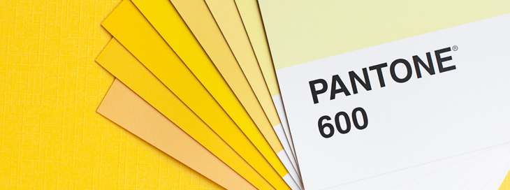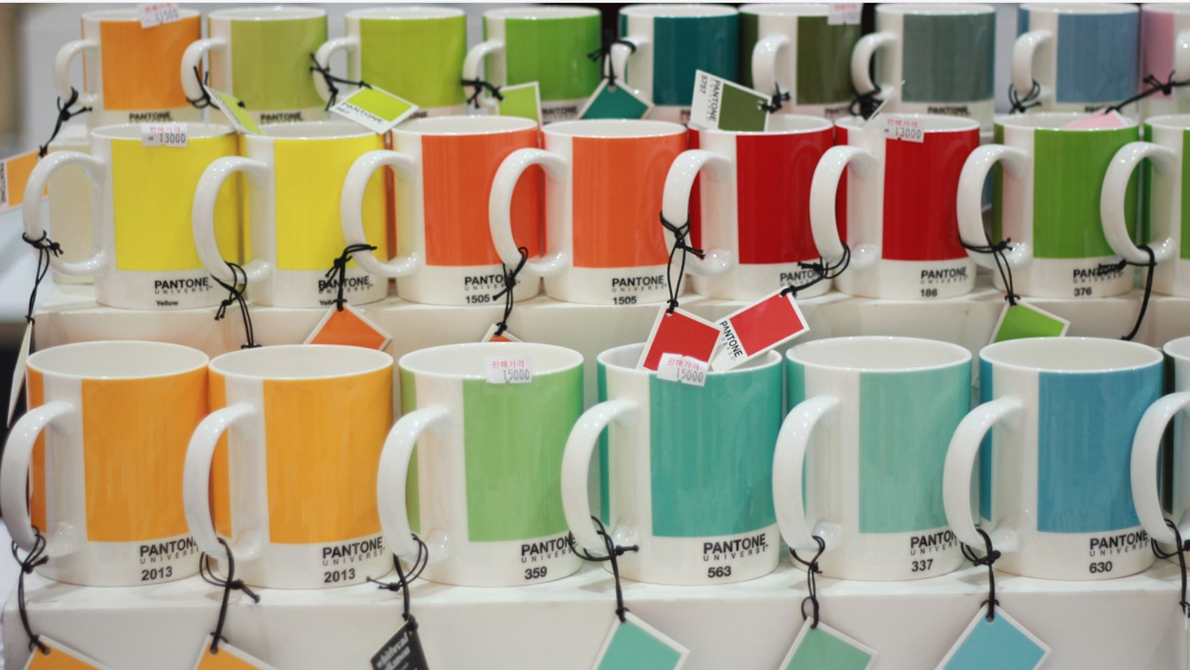
Every single day, over 10 million designers and manufacturers work with Pantone colours to select, communicate and approve the colours in designs. When it comes to screen printed T-shirts, or any screen printing onto fabric, Pantone references are the gold standard for colour matching.
What are Pantone Colours?
A Pantone Colour, is the code given for a specific shade of colour. Brands often have their own Pantone colours, enabling them to simply reference a specific colour that can then be matched across all materials. Many brands today are recognised by their colours alone, a great example of this is Tiffany, most know it’s Tiffany Jewelry if the box is Tiffany blue.
To match your colours to a Pantone reference, we use something called the Pantone Matching System (PMS), which is made up of thousands of numbered swatches; it’s a bit like a dictionary for colours.
The downside to this system is that your screen cannot display Pantone colours, nor can they be printed with a standard digital printer. While this may seem like a big problem, it ensures consistency; screens are backlit and have different colour settings, among other variables that will mean colours look different on different machines.
With the Pantone Matching System, you can ensure your colours look the same across everything. Despite not showing on screens accurately, Pantone matching is the industry standard way of matching colours.
History of Pantone
Pantone started back in 1963, when they revolutionised colour communication by creating a universal colour language. For the first time in history brands, and designers could send artwork to printers confident that they would get the colours they needed every time, no matter where they sent it.
Today, Pantone colours are the industry standard not only for screen printing, but across many industries, whether it’s the colour of fabrics for interior design, for signage, or for screen printed T-shirts.
Why Use Pantone Colours For T-Shirt Printing?
When screen printing T-shirts or any other clothing product, providing us with a Pantone reference is super useful. It’s this that allows us to ensure we are able to match your colour requirements perfectly.
This not only provides brand consistency, but also allows you to be able to sell more products as a result of increased brand recognition. Studies show that the right colour can increase brand recognition by up to 87%.
When it comes to product development, the right colour can be the special something that stops someone in their tracks and captures their attention. According to Pantone’s research the right colour can sell products and ideas more effectively, by 50-85%.
With Pantone the global gold standard for colour, there is no better way to match your colours when it comes to screen printing.
Pantone Matched Embroidery
When it comes to embroidery it’s not quite as simple as screen printing. We still ask for a Pantone reference from you, however we (nor any other embroidery company) are able to provide an exact Pantone match.
This is because unlike ink, there is a limited number of threads available. With ink you can mix colours to create the Pantone required, with thread you don’t have this luxury. All is not lost though. We use a conversion system that allows us to select the closest possible match to your Pantone, ensuring the best results possible.
This is industry standard, and the same process is used worldwide to ensure the best colour matching possible for your custom embroidered clothing, whether it’s embroidered polo shirts for workwear, or embroidered bags for promotions.
DTG or Digital Print Processes & Pantone Matching
On smaller orders, digital print techniques like DTG printing (direct-to-garment) are typically used. Due to their nature, these processes don’t allow for Pantone matching.
A Pantone reference is still useful though, as it allows us to get as close as possible to your colour requirements. Although it will never be an exact match. This again is industry standard when it comes to DTG printing or any digital process, and is the same for every custom clothing printer.
What Is The Difference Between CMYK and Pantone Colours?
CMYK, also known as the four-colour process, uses the main colours Cyan, Magenta, Yellow and Black mixed together to form a vast range of secondary colours. CMYK is primarily used in inkjet printing and in the custom t-shirt business it is sometimes used in DTG printing. CMYK is most suited to jobs where exact colour matching is not required.
Pantone colours, on the other hand, use a series of pre-determined colours to enable greater accuracy and consistency when printing. Pantone colours are also usually much brighter than CMYK colours and can include fluorescent and metallic shades. However, Pantone printing can be more expensive than CMYK as the machinery must be prepped each time, meaning that it is more economical to print large runs of screen-printed designs than small orders.

Finding my Pantone Colour
While screens do not accurately display Pantone colours, a good place to find the closest Pantone match to your required colour is the Pantone Colour Finder, you can use an RGB, CMYK or even a Hex code to find the closest possible Pantone matches.
This is one of the ways you can look to find the most suitable Pantone reference if you’re not familiar with the colour matching system. Alternatively, if colour is absolutely critical, we highly recommend purchasing one of the appropriate Pantone Swatch Books to work out the colours you need.
If working with a graphic designer, they will usually be able to provide you with the required Pantone reference. Or if you’re an established brand or organisation, your design & marketing team will have a Pantone reference on file for any logos or brand associated imagery.
Coated and Uncoated Pantones - Which Is Best For Screen Printing?
Pantone swatch books contain two variations of the same colour, known as coated and uncoated colours. This refers to either a gloss or matte finish to the inks when printed on paper. When screen printing T-shirts, we use Coated colours or ‘C’ Codes as they are the best and most accurate match for screen printing. The Plastisol inks that are used in screen printing have a natural shine to them that best reflects the coated Pantones.
Can TCX Pantone References Be Used For Screen Printing?
We often get provided with TCX Pantone codes. While these codes are commonly associated with textiles, it’s typically used in the context of dying fabrics, not in screen printing onto them. With this in mind, we’re not able to match TCX codes and generally require a Coated Pantone reference as described above.
Pantone Matched T-shirts
If you are an established brand with your own Pantone colours, you may wish to go one step further than simply Pantone matching the artwork by having fully custom colour clothing. It is possible to Pantone match the fabric of the t-shirt to your brand colours. These garments are required to be custom made and at A.M Custom Clothing, we have a minimum order quantity of 1000 units for this type of bespoke manufacture. As a result, this process is only suitable for established brands looking to invest in custom uniforms or merchandise. Pantone matched T-shirts and clothing may be more expensive, but they make a professional and high-quality impression on your customers and help them to associate certain colours and products with your brand.
Ensuring Best Quality Screen Printing
If you want the best screen printing results, and colours that you can trust, then using the Pantone Matching System is the answer.
If you’re unsure on the right Pantone colour, or just need some help with preparing custom printed clothing, get in touch with one of our friendly team here.
This post was updated in September 2021 with the most up-to-date information and advice from our expert print and embroidery team.
* Find this article useful?
Sign up to our newsletter, for the latest news, resources, trends and exclusive discounts.
Join our newsletter
If confirmation doesn't arrive in your inbox following subscription check your spam/junk mail.


